Typography is the art of arranging types to convey meaning and communicate information. There are many ways to arrange text, but there are three basic types of typographic elements: letters, numbers, and symbols. Letters include words, sentences, paragraphs, and headlines. Numbers include dates, times, prices, and measurements. Symbols include copyright symbols, mathematical formulas, and icons. Typography has been used by humans since ancient times. The first written language was developed around 3200 BC, and the earliest known example of calligraphy dates back to 3500 BC. In this blog, you’ll learn about typography in Graphic Design, its role in visual communication, and how to apply it to your own work.
Why Does Typography Matter?
In graphic design, typography is one of the most important elements because it sets the tone for the entire piece. If the typography isn’t right, then the rest of the design won’t work.
For example, if the headline font is too big, then the body copy might be difficult to read. On the other hand, if the body copy is too small, then the headline might look overwhelming.
When designing a website or other printed material, it’s important to consider the role of typography. In fact, according to the American Institute of Graphic Arts (AIGA), there are four main types of typographic elements: text, headlines, subheads, and captions.
Text is the most basic element, which includes body copy and headings. Headlines are larger than text and usually appear at the top of a page or document. Subheads are smaller than headlines and typically appear below them. Captions are used to identify images and graphics.
How to use typography in graphic design?
Learn more about canva graphic design : Canva Graphic Design Tips
Elements of typography:
1. Fonts and typefaces:
The term font comes from the French word feuilleton which means leaflet. It refers to the small leaflets used to print newspapers.
Typefaces were originally made up of individual letters, numbers, punctuation marks, and symbols. They were designed to fit on a page and look good together.
Kinds of typeface:
The first typeface was created by Johannes Gutenberg around
It was based on the Roman alphabet and used black ink on white paper. This was the beginning of printing. In the 15th century, printers began using a movable metal type, allowing them to print multiple copies of books. They were able to make changes to the text without having to reprint the entire book.
There are many different kinds of fonts, which are just fancy ways of saying ‘typeface’.
The most common ones include:
2. Color
There are many ways to choose the right colors for your website. You can use a color scheme generator to help you find the best combination of colors. Or, if you prefer, you can try using a color wheel to pick a single color that will complement all the others on your page.
Color is also used to convey meaning.
For example,
There are two main reasons why color is so important in graphic design.
When designing a website or other printed material, using color effectively can help guide users toward certain sections of content.
For example, if you want people to read a particular section of the text, use bolder fonts and larger font sizes. If you want them to click on a link, use contrasting colors. And if you want them to scroll down a page, use lighter shades of gray.


3. Hierarchy
In the early days of printing, newspapers used typefaces that were designed to be easy to read quickly. They had small letterforms and thin lines.
These characteristics made headlines easier to read than the body copy. Today, most newspapers use larger typefaces and bolder headlines to draw attention to the main story.

4. Consistency
You may want to use a consistent color scheme throughout your slides. This makes it easier for viewers to follow along and find information quickly.
However, don’t overdo it; too many colors can make your slides hard to read. Use only two or three colors per slide.

5. White space
The term ‘white space refers to the empty areas surrounding the text and graphics on a page. It’s important because it gives your reader room to absorb information without being distracted by the content itself.
Too much white space will make your design look cluttered and busy, while too little will leave gaps where the eye doesn’t know where to go next.
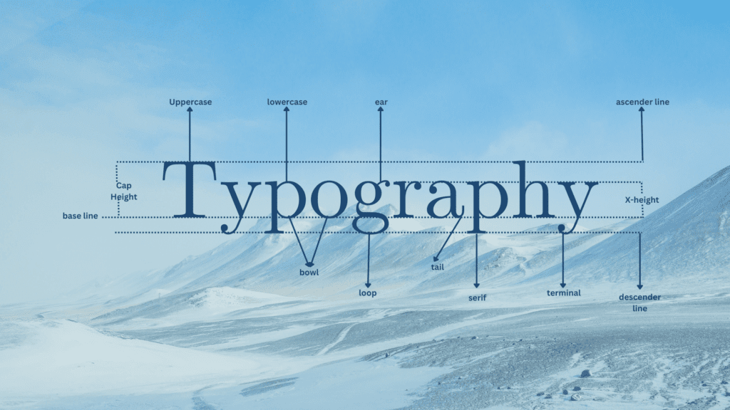
6. Baseline
The baseline is the horizontal position on which the text sits. It’s usually measured from the top of the page to the bottom of the first line of text.
This measurement helps designers create consistent spacing between text and images.
7. Cap Height
The cap height is the distance between the top of the tallest letter and the bottom of the lowest letter. It is measured in points.
In most fonts, the cap height is set at about 20 points. This is because the average person reads the text at around 20/20 vision.
8. X-Height
The x-height is the height of the letter x. It’s measured from the bottom of the baseline to the middle of the line above the baseline.
The x-height is usually expressed as a percentage of the font size. So if the font size is 12 points, the x-height would be about 1/6th of the total height of the font.
9. Ascenders
Ascenders are parts of letters that extend above the baseline. They may be found in capital letters, lowercase letters, numbers, punctuation marks, and symbols. The ascender is usually the topmost portion of a letter, although there are exceptions.
10. Descenders
The descender is a glyph used in writing systems to indicate a descending letterform. It is usually found on letters that descend below the baseline, such as g, p, q, y, z, etc.
11. Weight
In typography, weight refers to the thickness of the strokes of letters. It is measured in points.
There are 12 points in a pica, which is 1/72 of an inch. So if you want to know how thick your font is, multiply the number of points by 72.
There are 12 points in each em unit. So if you want to make your text bolder, you need to increase the size of the em units.
There are four main types of weights:
Light is the thinnest weight, while bold is the thickest.
12. Tracking
Tracking is the distance between each letter in a typeface. It’s measured in points. The default setting on most word processors is 12 points, which is equivalent to 1/72 inch.
This is usually fine for body copy, but if you want to use larger fonts for headlines, you may need to increase the tracking.
13. Kerning
The term “kerning” comes from the French word “kern”, meaning “to cut”.
In typography, kerning refers to the adjustment of the spacing between individual glyphs within a font. This is done to create a more pleasing visual appearance.
14. Leading
The leading is the amount of white space between each line of text on a page. It helps readers scan through the content faster and easier.
15. Adding Text Effects
In graphic design, text effects are used to add interest and variety to a piece of artwork.
These effects include shadows, reflections, glows, and other special effects. Some designers use them to emphasize certain words or phrases, while others use them to create a mood or atmosphere.
How to perfectly use typefaces to create stunning designs:
The first step to creating a great design is to choose the right font. There are so many options out there, and each has its own pros and cons. You need to know which ones will complement your design and which ones won’t.
Create stunning designs using fonts. Choose a font that suits your design and use it consistently throughout your project. Fonts come in many shapes, sizes, colors, and styles. Experiment with different options until you find the perfect fit for your design.
1. Create a hierarchy with fonts:
Hierarchy is created through typography. Large typefaces draw attention to themselves, while smaller ones fade away. This creates a visual hierarchy within your content.
2. Use different fonts:
Fonts are often used to make headlines and subtitles stand out. They should be chosen carefully so that they don’t distract from the main content. In the example above, the headline uses a bold font while the subtitle uses a regular font. This helps readers focus on the content without being distracted by the typeface.
3. Make it easy to read:
The font size should be large enough so that all the words on the page are legible. It’s best to use a 12-point font, which will give you about 150 characters per line. You may need to increase the font size if your document is too small.
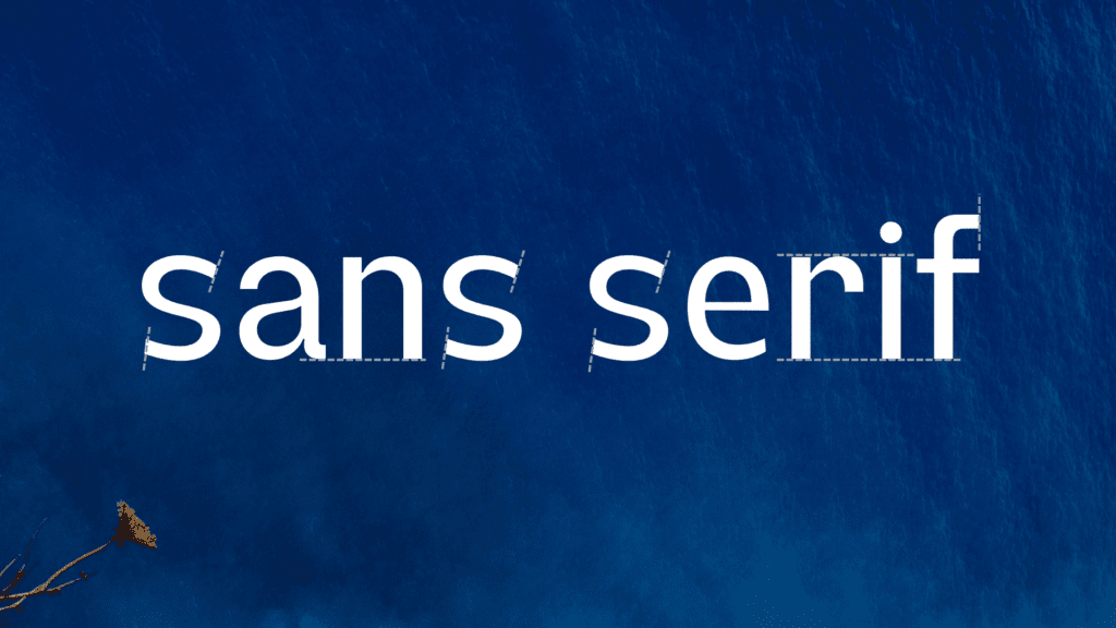
Serif and sans serif typefaces are two of the most common types of fonts used on websites today. They come in many different variations, but they share some similarities. Both have strokes around each letter, which make up the serifs. Sans serif fonts do not have these strokes, so they look much cleaner than serif fonts.
4. Use fonts that fit your style:
Fonts are used to make text look good on screen. They can be used to create a professional feel or to add character to a design. There are many different types of fonts available, each suited to a particular purpose. Some fonts are designed to be legible in small sizes, while others are meant to be used in larger sizes.
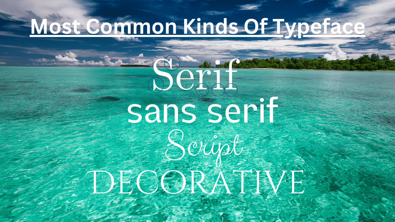
Type classifications:
There are many different types of fonts available on computers today. They come in various sizes and weights, and each type has its own characteristics.
The term ‘typeface’ comes from the French word typographic meaning ‘typesetting’.
It refers to the set of characters used to create text on paper.
In contrast, a font is a specific version of a typeface designed to fit a certain purpose.
They are classified according to how they look when printed.
Some examples include:
1. Serif:
When printed, serif fonts are often used for text because they look better than sans-serif fonts. They’re also easier to read because they don’t get too small or too large. Sans-serif fonts, on the other hand, tend to look good only when displayed on screens.
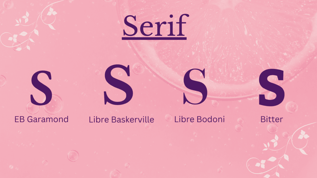
They’re not just for decoration though; they add weight to the letters and help distinguish words.
There are many different types of serif fonts,
but the most common ones include Times New Roman, Garamond, Palatino, Bodoni, and Optima.
2. sans serif
The sans serif font family includes many familiar faces like Times New Roman, Helvetica, and Verdana.
These fonts are often used in print media because they’re easy on the eyes. However, some people find them too plain and boring.
These fonts are often referred to as “clean” because they look simple and uncluttered.
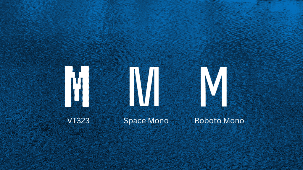
3. Monospace
Monospace fonts are used when there is no room for variation in the size of the letterforms. This makes them ideal for coding because the spacing between each character is consistent.
It’s used when writing code because it helps make sure that your code looks neat and tidy.
4. Handwriting
The first typeface to use handwriting as its inspiration was the Futura font, released in
It was created by Max Miedinger and Eduard Hoffmann for the Swiss company Monotype. It was based on the handwriting of German artist Paul Renner.
The term handwriting refers to any form of writing that looks like someone wrote it with a pen on paper. It could be a letter, a note, a signature, or even a drawing. There are many different types of handwriting. Some people write very neatly, others scribble all over the place. Some people use cursive while others prefer printing. Some people write in pencil while others use ink.
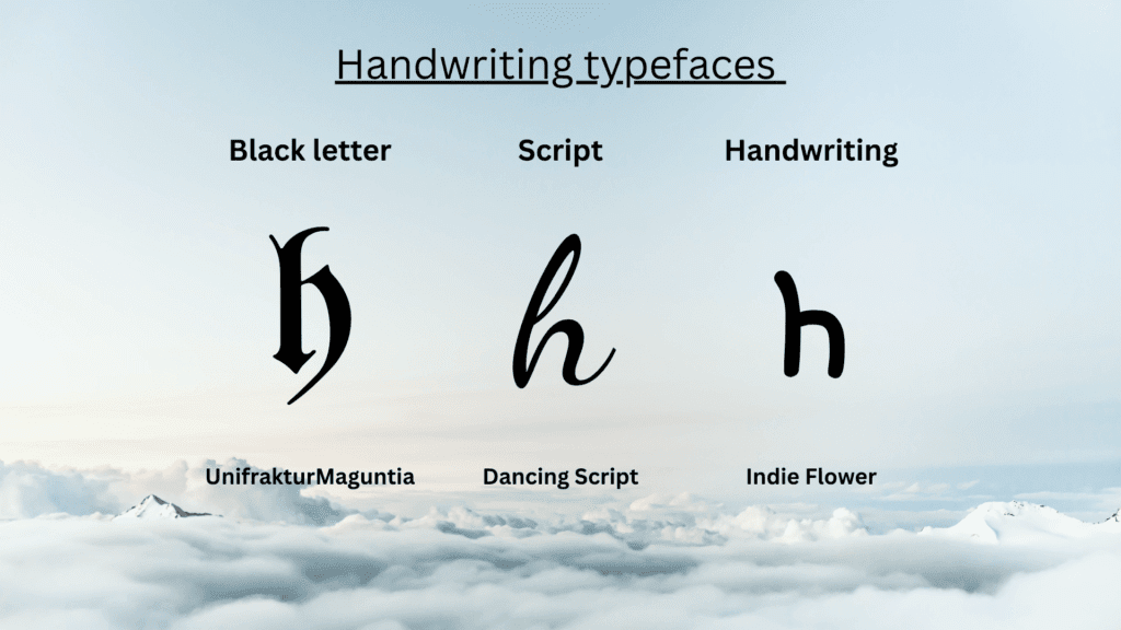
The following forms exist for them:
1. Black letter: UnifrakturMaguntia
The blackletter typeface is a serif font with thick strokes and heavy weights. It was designed in the early 20th century by Morris Fuller Benton, who wanted to create a new typeface that would look like handwriting. He based his design on the letters used in medieval manuscripts.
2. Script: Dancing Script
The term script comes from the Greek word skriptos meaning written. It refers to any kind of handwriting, whether cursive or block printing. In the context of calligraphy, it usually refers to the practice of copying a pre-existing text using a pen or brush.
3. Handwriting: Indie Flower
The act of writing down words on paper, usually using pen and ink.
5. Display
The term ‘display font’ is used to describe any typeface that is designed primarily for use in print media, especially newspapers and magazines. It is usually a condensed form of a regular typeface, with a smaller x-height, narrower proportions, and tighter kerning. This makes it easier to read quickly and efficiently.

The 5 most important fonts for creating stunning headlines are:
There are hundreds of different fonts available today. And with so many options, choosing the right font can be overwhelming. So we’ve narrowed down our list to five of the most popular fonts used by designers. These fonts will help you create beautiful headlines and captions.
In the past few years, there has been a resurgence in interest in typography. Designers are using typefaces to create striking visual effects. Some designers use typefaces to convey messages, while others use them to add personality to websites.
In the modern world, we use typefaces to communicate information. Whether it’s a headline, a poster, a website, or a book cover, typeface plays a major role in conveying the message.
In graphic design, typography refers to using typefaces (fonts) to convey information. There are many different types of fonts available, each with its own unique characteristics. Some fonts are bolder than others, some are easier to read, and some are more decorative.
1. Aleo (Font):
Aleo is a typeface designed by Alessio Laiso, a designer based in Italy. It’s a modern slab-serif typeface with a strong emphasis on legibility. You can choose between six different styles, each with a slightly different personality.

2. Calendas Plus (Font):
Calendars Plus is a beautiful font designed by the talented team at Typekit. The font comes in two versions, Regular and Bold. Both fonts come in four weights, each with matching italics. You can use the fonts on websites, blogs, magazines, newspapers, books, posters, flyers, invitations, business cards, social media posts, and much more.

3. Bariol (Font):
Bariol is a great choice for headlines and titles because it’s friendly and fun. It works well for both print and digital projects. The regular weight is perfect for body copy, while the italic is ideal for headings and subheads.

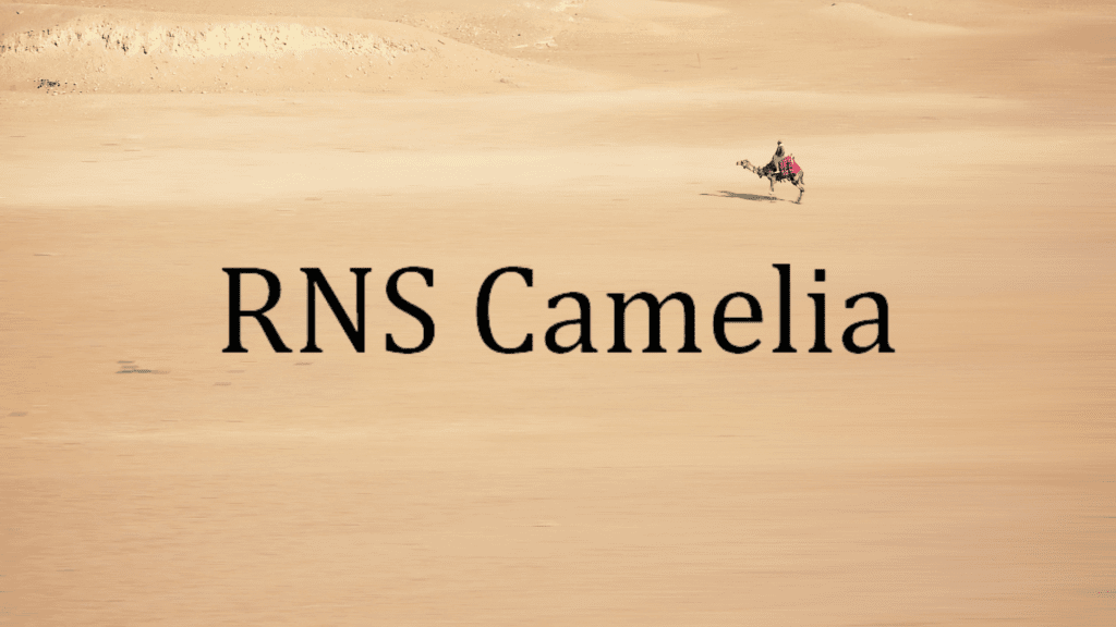
4. RNS Camelia (Font):
The word ‘RNS’ stands for ‘Roman Numeral System’. It’s a system used to represent numbers in Roman numerals. This font is inspired by the way these numbers were written in the 1920s and 30s.
5. Addington CF Serif (Font):
The Addington CF Serif font family includes seven weights, ranging from light to heavy. It comes with a wide range of glyphs, making it suitable for use across a variety of industries. This makes it a great choice for any kind of headline, whether it’s on a website, magazine cover, or business card.
The Addington family is a set of fonts designed by Matthew Carter. It includes six regular faces and two italics. All the fonts are based on the original design of the Addington typeface, which was created in the early 20th century.

Top 15 Professional Fonts for Graphic Design:
There are thousands of fonts available right now, so every designer needs a good collection of professional typefaces. But which fonts are an absolute must? Here is a list of the top 10 typefaces that graphic design professionals use most often:
Styles Guide
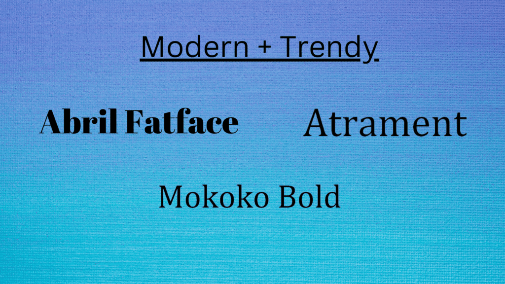
Modern + Trendy:
Abril Fatface:
Josep Fontcubertas and Veronika Burian created it. In 2007, the font was licensed to Adobe Systems Incorporated.
The font is inspired by the lettering on vintage signs found in Buenos Aires, Argentina. It features a wide range of characters, including numbers, punctuation marks, and symbols.
Atrament:
The Atrament font family consists of four fonts: Atrament Regular, Atrament Bold, Atrament Italic, and Atrament Condensed. All four fonts share the same basic design, which makes them ideal for headlines and display use. They are all designed to look good on both screen and paper.
Mokoko Bold :
The Mokoko Bold font family includes bold versions of the regular fonts in the family. It contains four weights: Light, Regular, Medium, and Black.